ShareFile & RightSignature
- Client: Citrix
- Role: UX & UI Design
Discovery
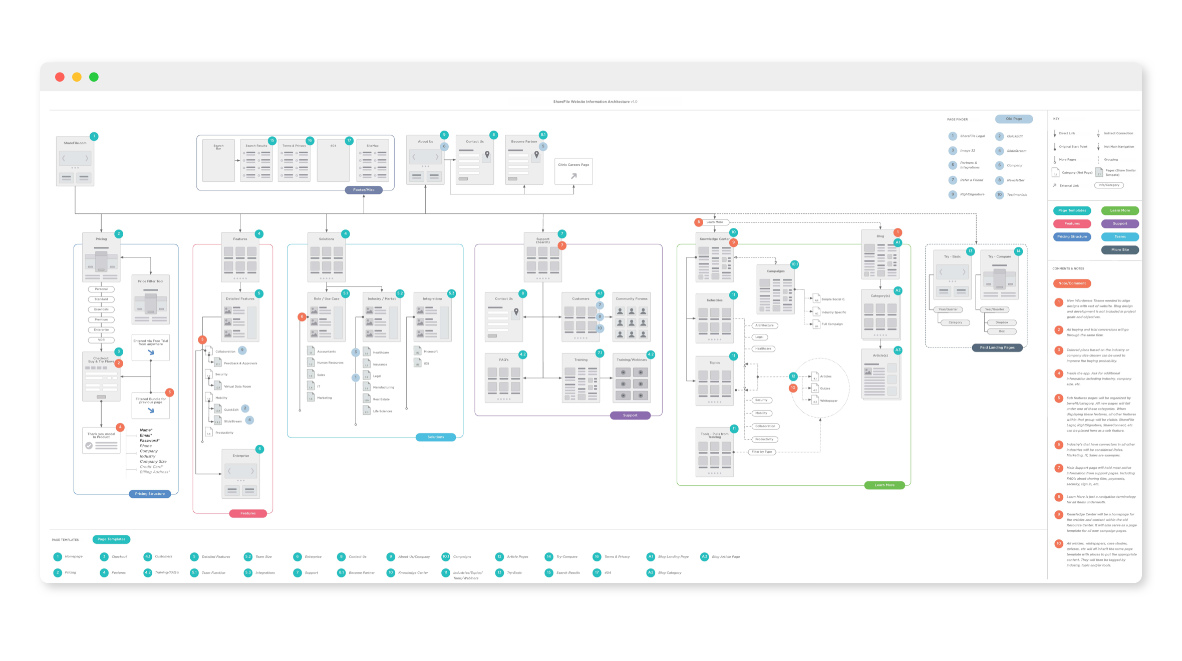
The main objectives of the redesign of the ShareFile website were to evaluate the navigation, information architecture, user experience of page layout, visual language being used on all websites, process of adding and removing content from the website(s), and the ability to measure accurately user engagement. We needed to organize content and requirements for the new website into key areas that can be maintained within the web ecosystem. (Resource/Business Center, Pricing & Plans, Support/Help, etc)
We also tested with customers and prospects on the issues of the current website. What is working, what is not working? Where do customers go? What do they find useful and what do they not find useful? Set a baseline evaluation score that will included SUS, NET promoter and customer feedback through user testing and surveys.
Solution
—Evaluating our Website
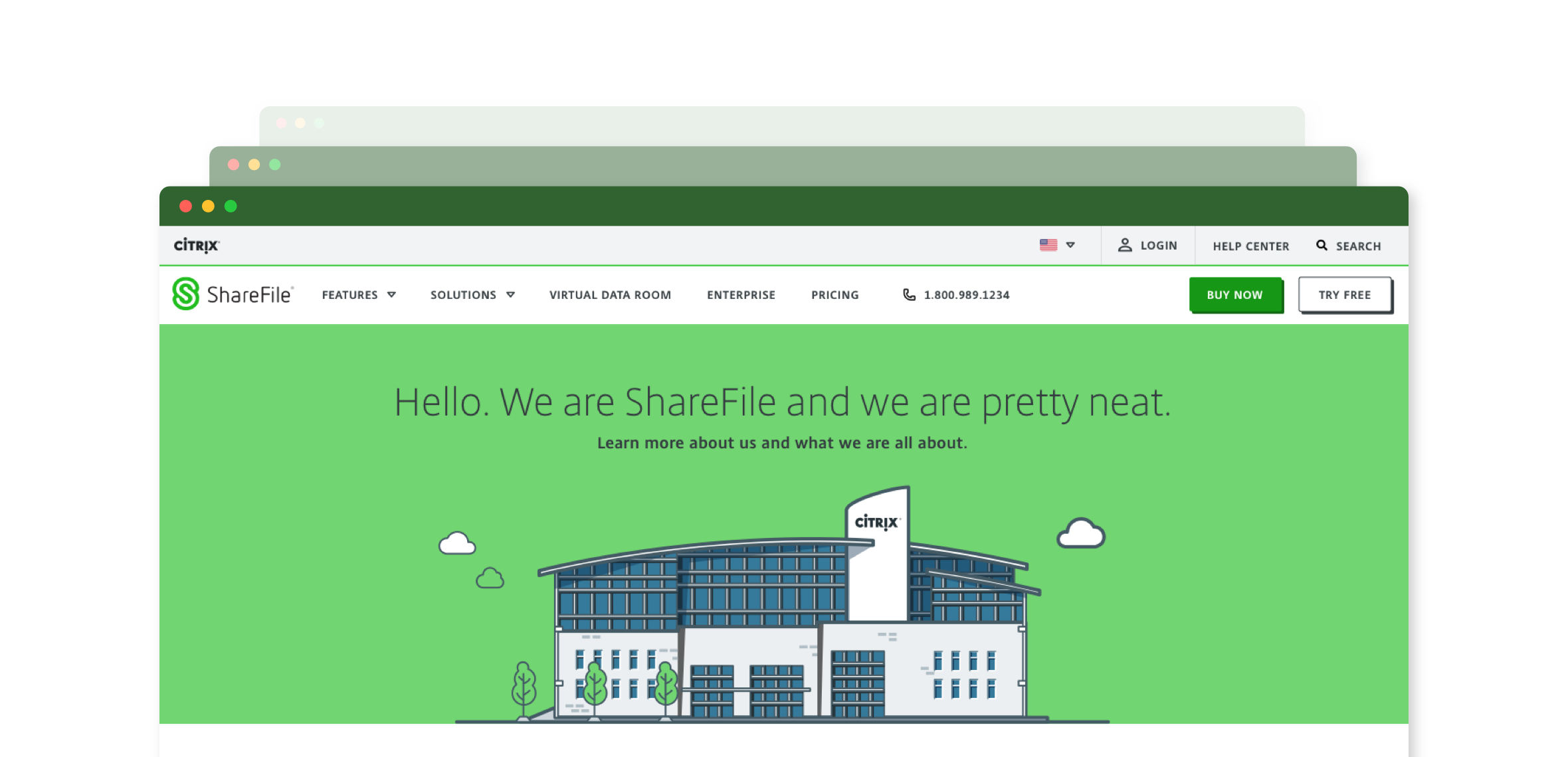
Most glaring issue is the branding and visual/vocal communication discrepancies between all SaaS websites as well as the Citrix corporate website. Content, messaging, tone, imagery, layout, user experience, user journeys, interfaces and pricing are all different from one web entity to another. These issues are amplified because they are also not aligned with print collateral, other creative content and the product themselves. There is no consistency between all the channels across all departments and products.
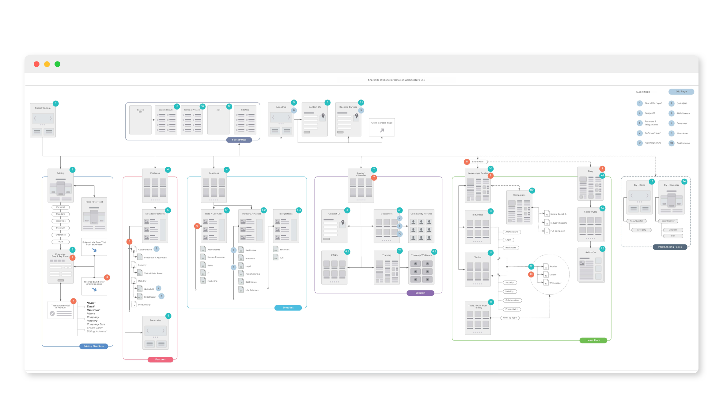
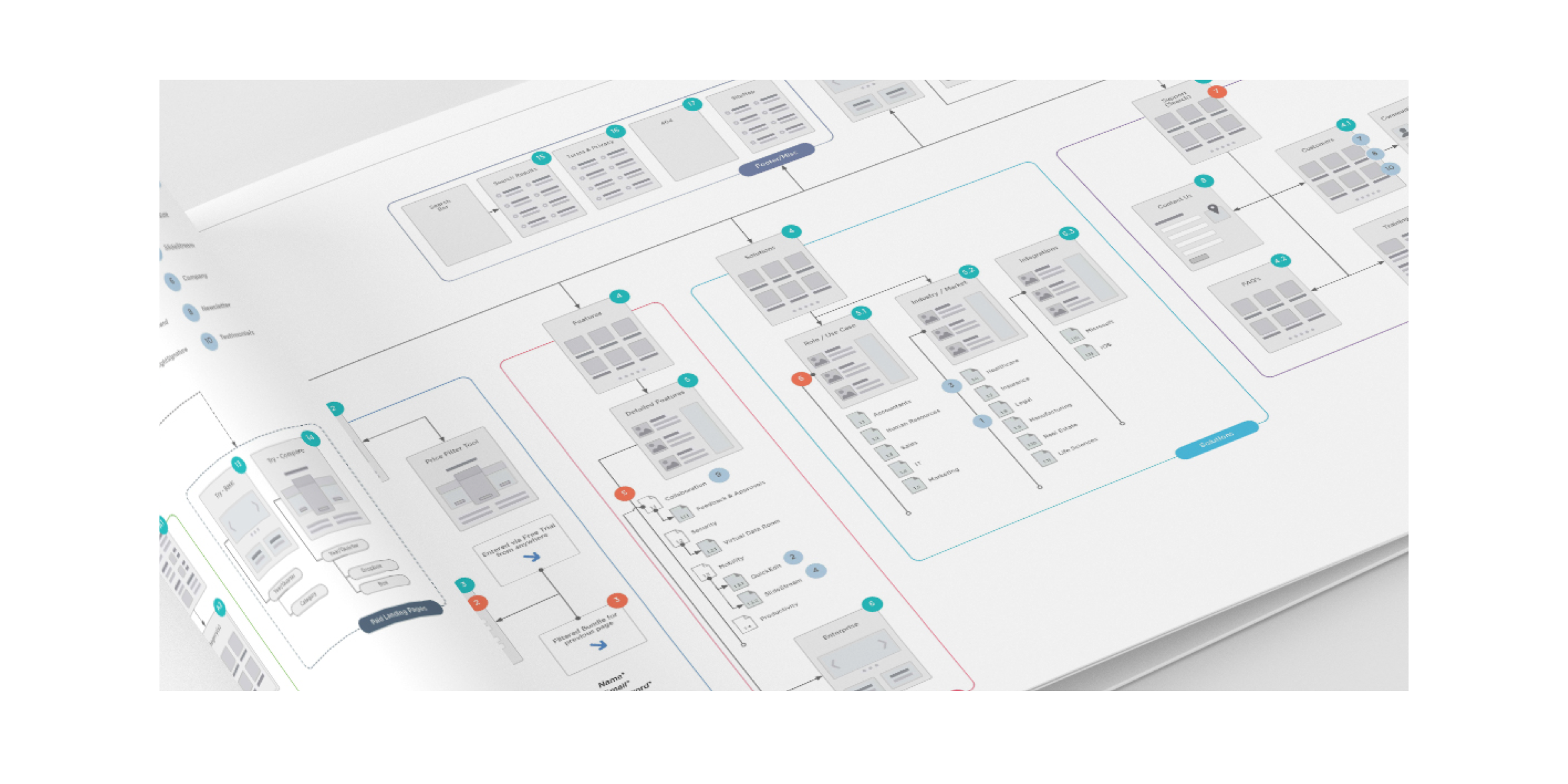
The architecture of ShareFile website is confusing and complex for no reason. Pages that don’t have connection to the main website, Marketo pages that are dead ends, acquired product pages that have not been integrated with the main website, subpages that have no breadcrumb or parent page, multiple page templates for similar content resulting in poor user experience across the website are just a few of examples of the issues regarding the current information architecture and site map.
—Baseline User Testing
Users were asked to make a purchase on our current website and give us their feedback and if purchasing the product was an issue. With only 2 participants fully completing the task and taking almost 5 minutes, there are some serious issues with how the buy now flow currently works. Major takeaways were that the process was too long, asked too many questions, required too much information, involved too much extra work/effort on the part of the user and some users didn’t even see the buy now option on their screen. One user was told their purchase could not be completed. There was also terminology that conflicted often between the “Free Trial” and “Buy Now”. Several users got confused when told to buy now with all the free trial terminology used on buttons, error messaging, thank you messaging, in the flow itself, etc. Fixing the buy flow was a serious priority with the website redesign.
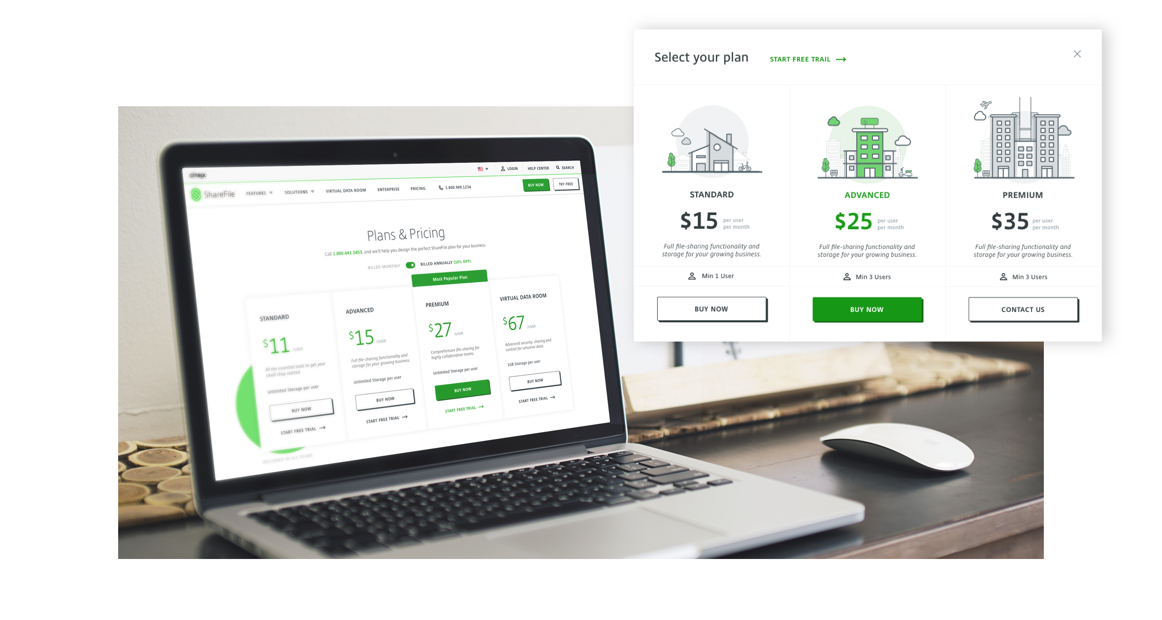
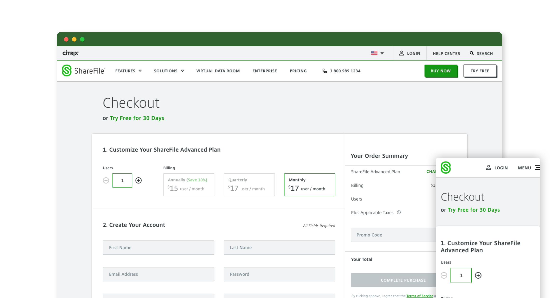
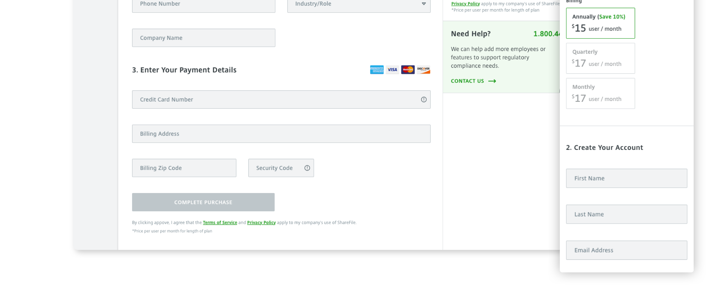
—Simplifying The Checkout Experience
The original checkout process was complicated over several steps and would leave the users confused by the final price based on the amount of users that we preselect for them and the subscription length. The new design was streamlined into a one page checkout process where the user could see all what they have completed and get a live summary of the total price in order to avoid sticker shock right before checkout. We also added in the ability for the user to select the amount of users they wanted, which helped those testing in understanding how they got to the final cost and why.
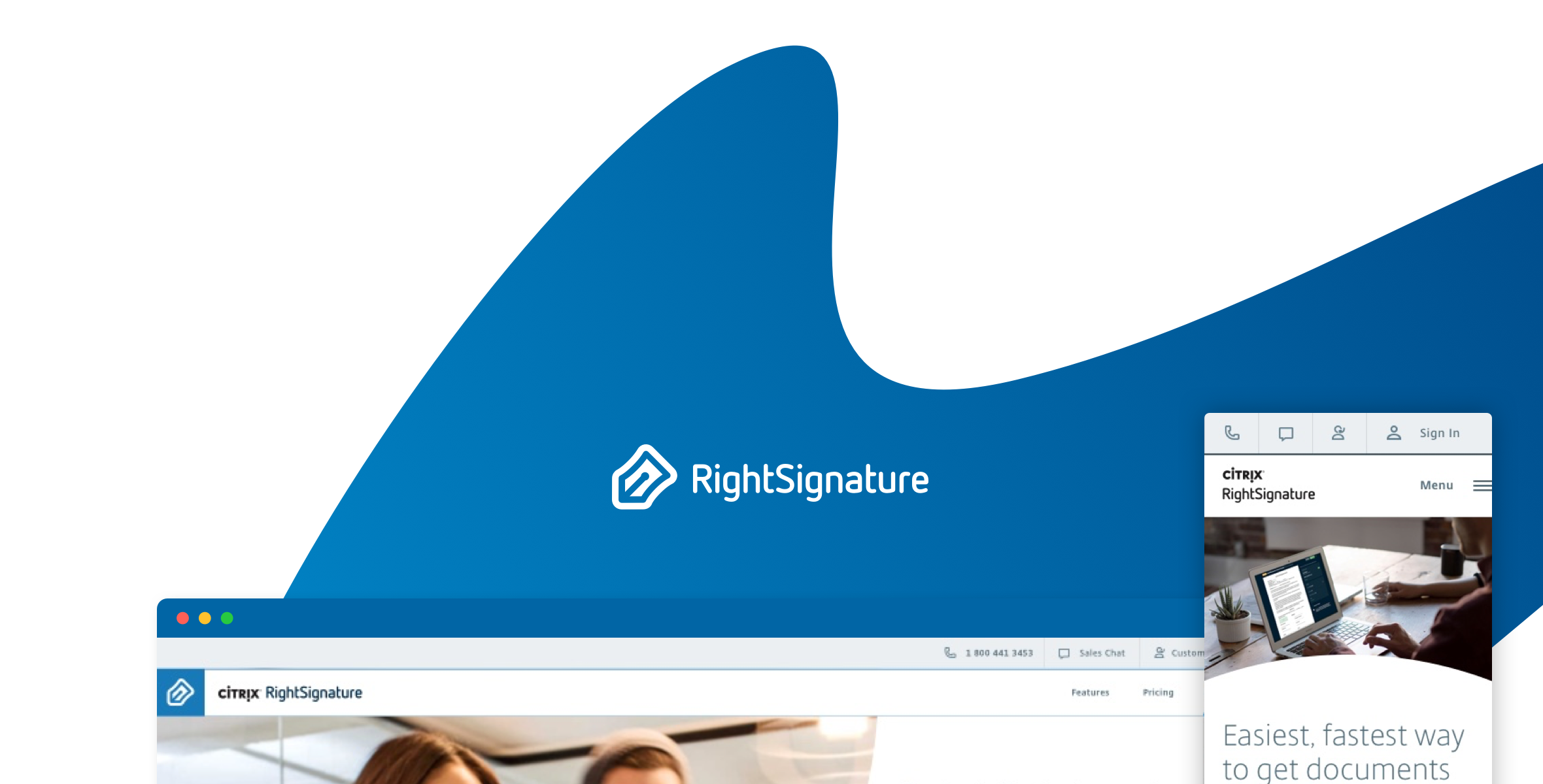
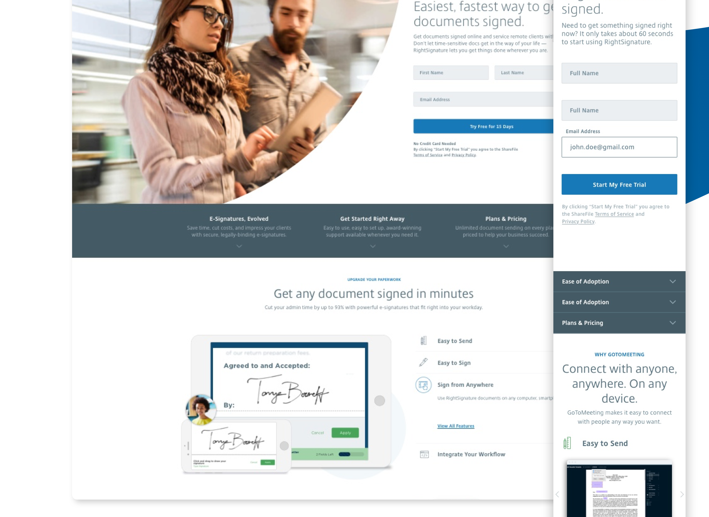
—Right Signature
RightSignature is a electronic signature application. Along with ShareFile, the RightSignature website needed to be updated to better align with the product and the company brand.